Aveek
Software Engineer Information TechnologyPart 3 : Android Constraint Layout (Design Layout Using Guideline & Barriers)
Malaysia 01 August 2018
What’s up readers? Thank you for reading the 3rd chapter of Android Constraint Layout. We have discussed the basic in Part1
and designed one layout with raw constraints only in Part2.
In this chapter, I am focusing on Guideline & Barriers. I will follow the same layout sample from Part2 and modify wherever I can. I believe, you will learn a new way of implementing the same layout.
For readers convenience, I am adding the sample again here..

and like previous article, I am going to add the textViews and imageViews inside the layout.
For better understanding, let me add the image from Part2.
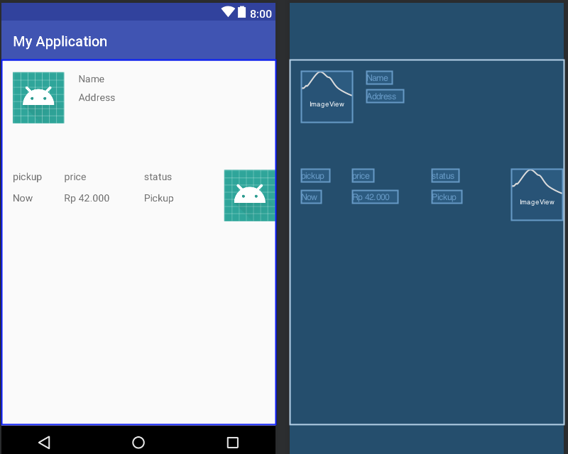
As you can see, I have added all of the necessary views inside the layout. Now, it’s time to create something great with Guideline & Barriers.
If you already have gone through my previous posts with Android Constraint Layout series, you surely have noticed I have mentioned several times, there are multiple ways of designing the same layout. Guideline is one of the approaches I am going to show.
Let’s start implementing..
Firstly, I am going to divide the entire layout in few segments. My plan is to divide the layout as few vertical and horizontal blocks actually. Let me show how.

Vertical and Horizontal Guideline
Since I have drawn the lines by hand, it might be slightly inaccurate from being straight line. However, this is understandable what I am trying to achieve. There are two different lines drawn, Horizontally ( Purple ) and Vertically ( Blue ).
If we divide the entire layout horizontally by 4, each of the segments get 25% of the entire screen which absolutely goes with our requirement.
Now, we can see the User Info section and the Contents sections are not equally divided. Therefore, we can divide it vertically as 60–40. As per the requirement, the bottom section will get the 40% whereas the top section will get 60% area.
That’s all of the information we need, in total we need 3 guidelines and 1 barrier ; 3 Vertical (Blue) and 1 Horizontal ( Purple ).
The Purpose of adding the Barrier is to control the movement of the Bottom contents as a Group.
Let’s see, how we can add Guideline & Barrier in our layout.

Add Guideline & Barrier from the panel

Let’s add the remaining vertical guidelines..

Hover on the guideline, click on the guideline, the percentage will be shown

The bottom contents are inside barrier

All components are now connected with the Guideline & Barrier with proper margins
The barrier is set above the bottom contents to make sure the contents always remain under that invisible line and we do not need to worry if it goes wrong ever! Pretty cool huh? :D

The User Info section also connected with the Guidelines

View with a shadow background on top of bottom contents
We have set every necessary views with the proper margins. To see the xml codes, kindly find the project in my Github Profile below.
NsAveek/ConstraintLayout
ConstraintLayout - Different way of implementing the same layout
In this post, I have tried to cover the concept of Guideline and Barrier. If a single person finds the post helpful, my effort will be successful. Thank you for giving your valuable time to complete this part.
Never stop learning !! :D